WSG Creative Studio
01
Crafting Excellence
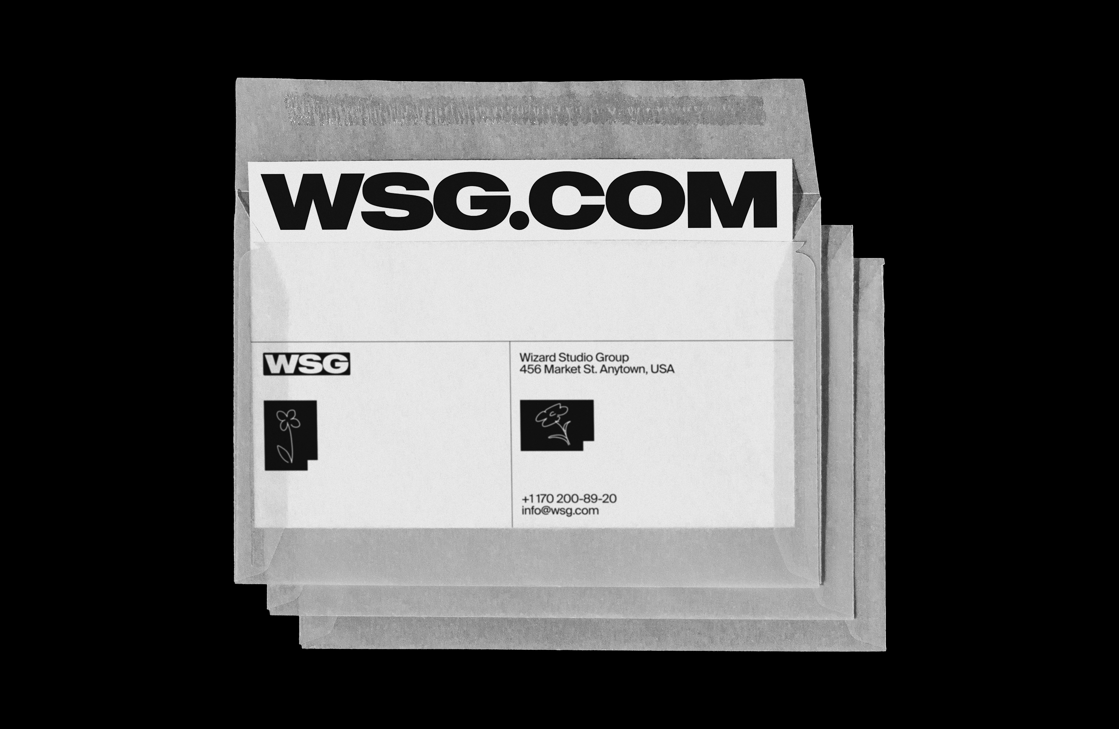
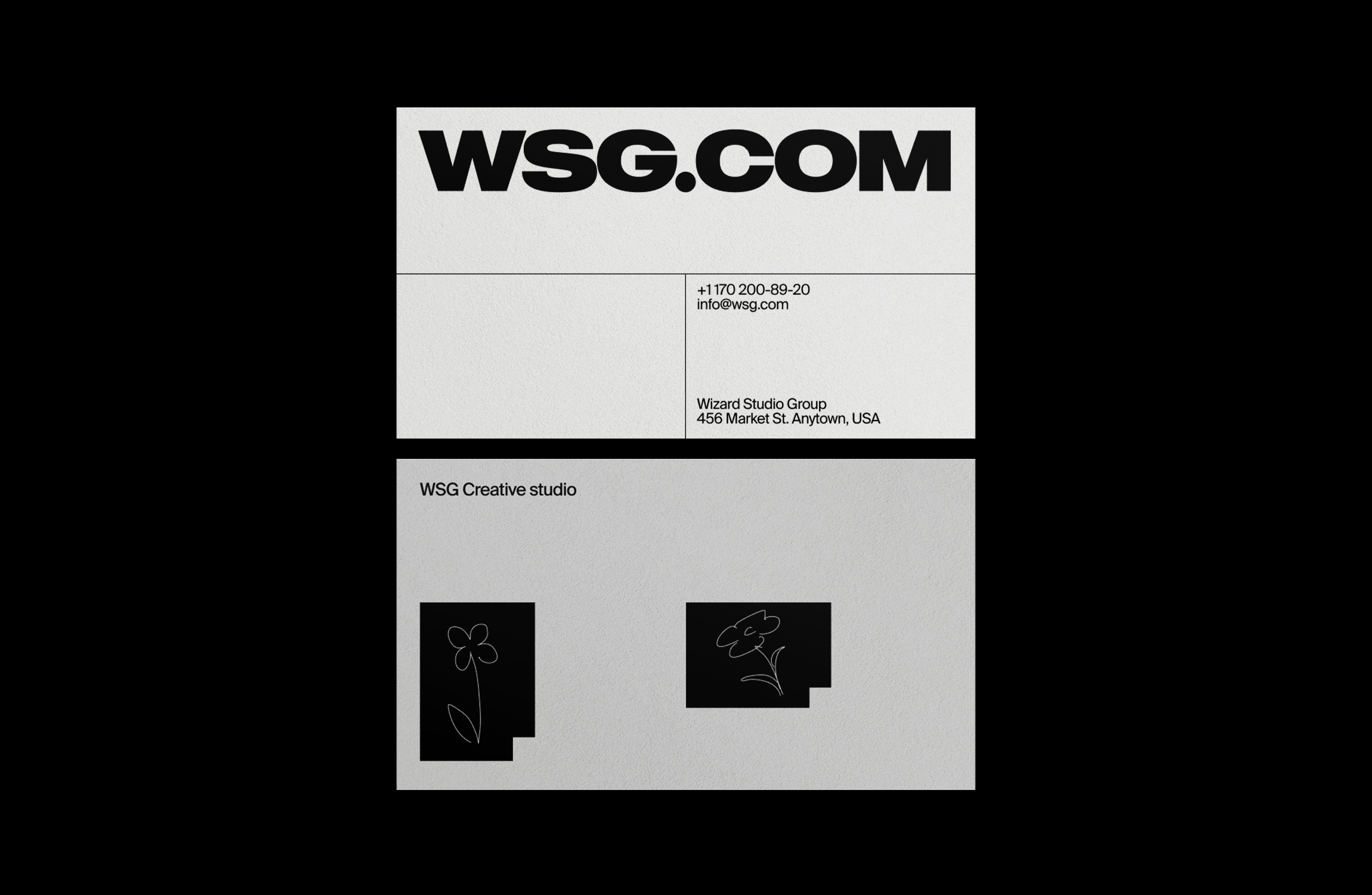
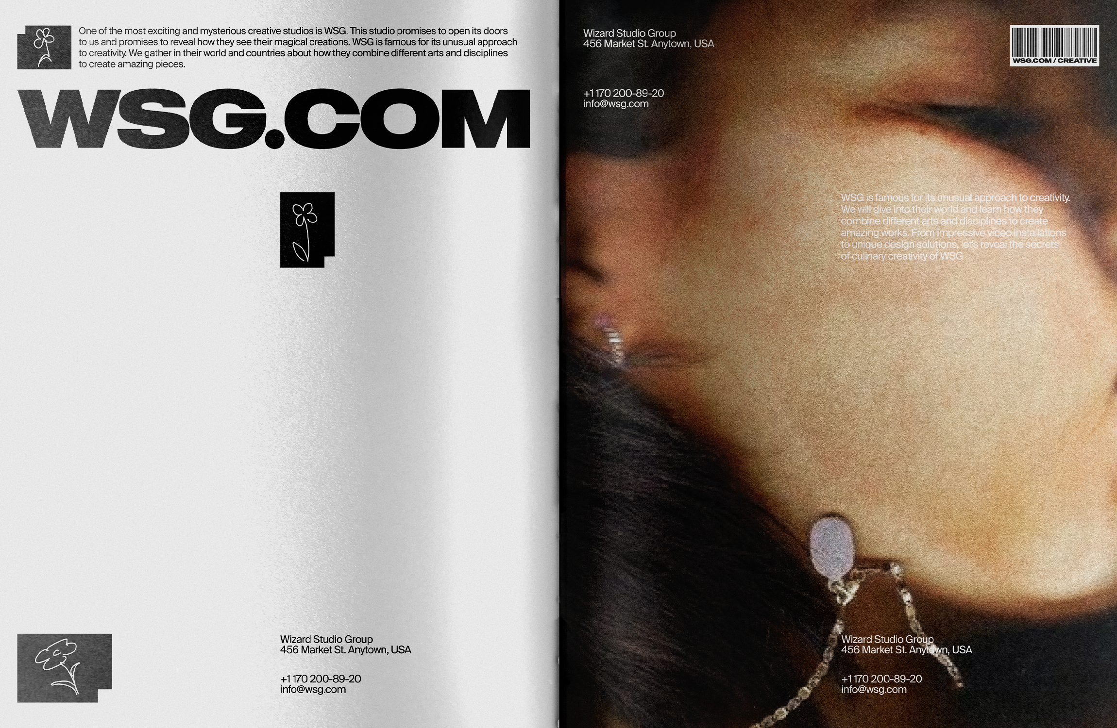
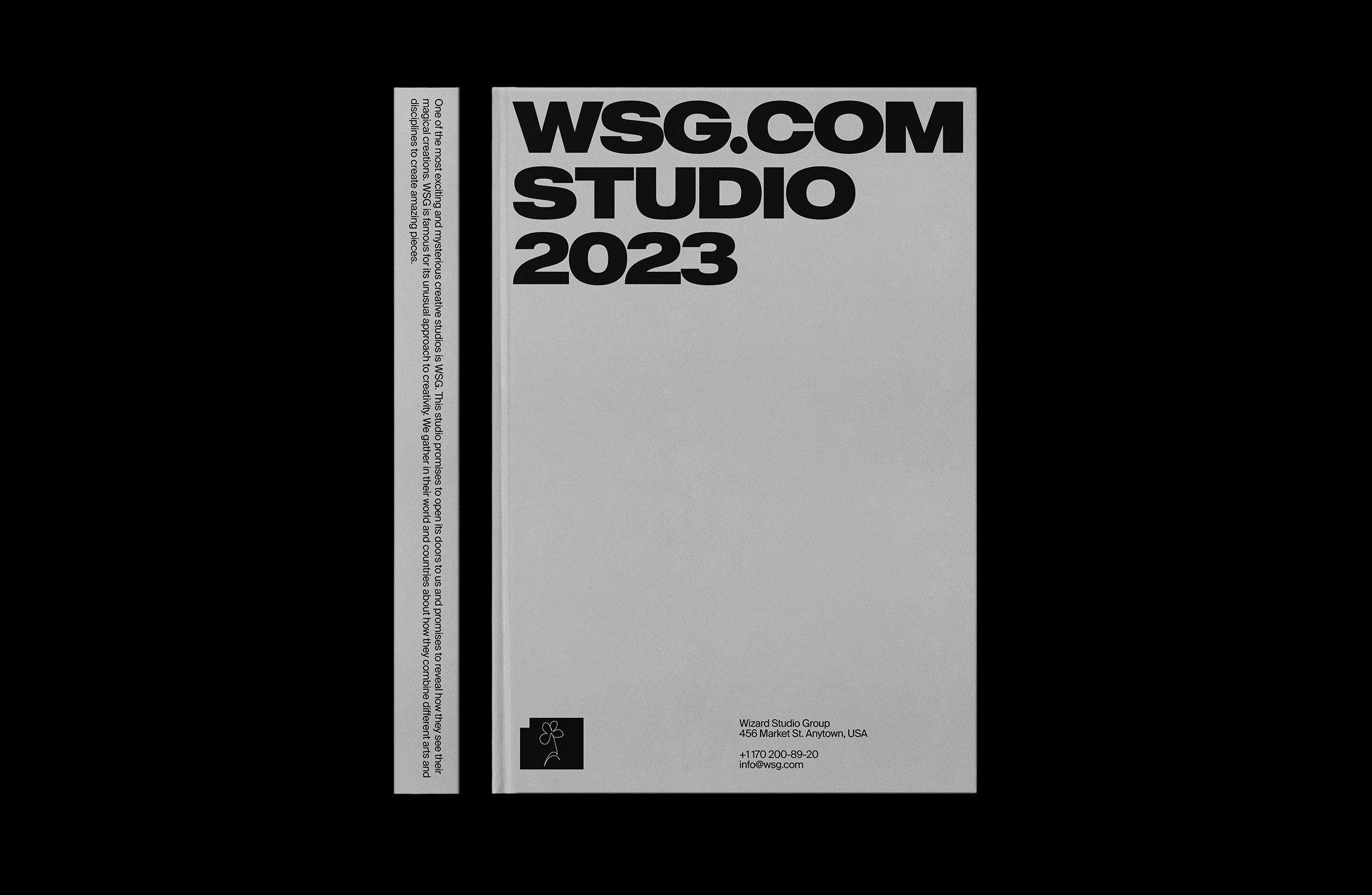
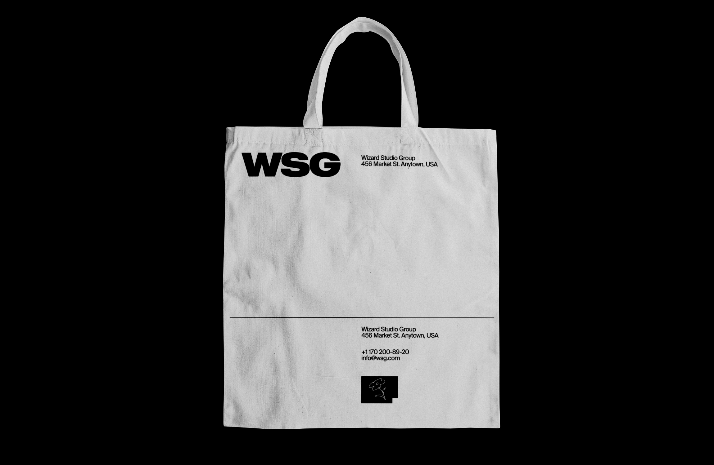
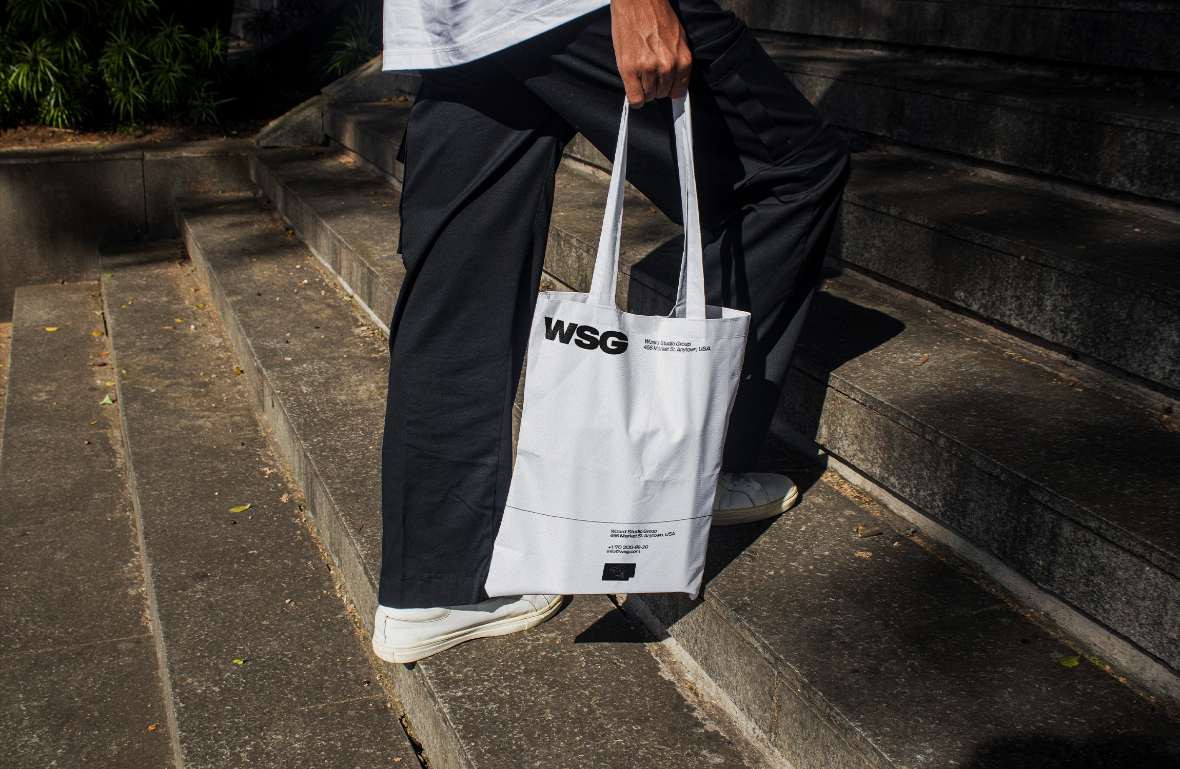
WSG Creative Studio needed an identity that could hold its own in a competitive creative landscape. The brief was ambitious: build a visual system from scratch that communicates authority, craft, and originality without relying on trends. We delivered a complete brand identity — logo and logomark, typography system, colour palette, brand guidelines, print collateral, and digital applications — designed to work across every medium and scale from a business card to a billboard.
02
Process & Methodology
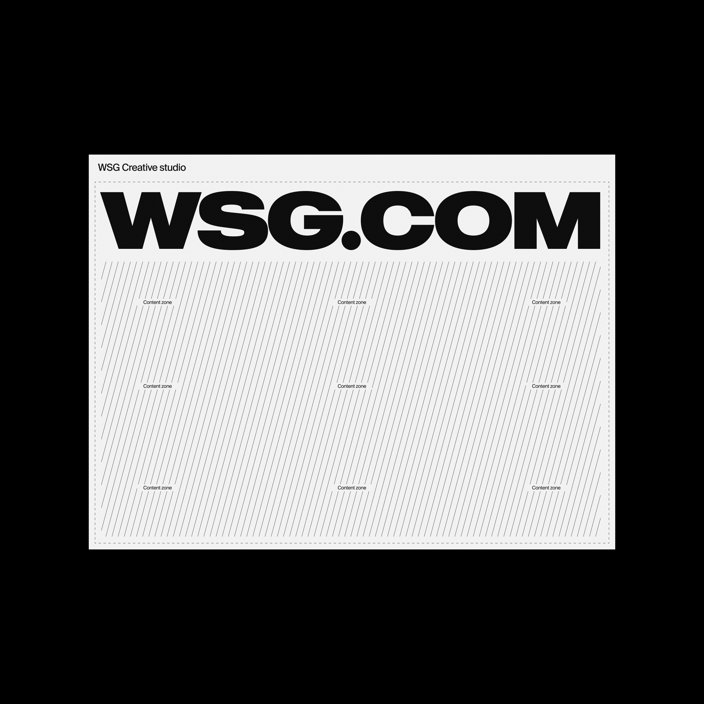
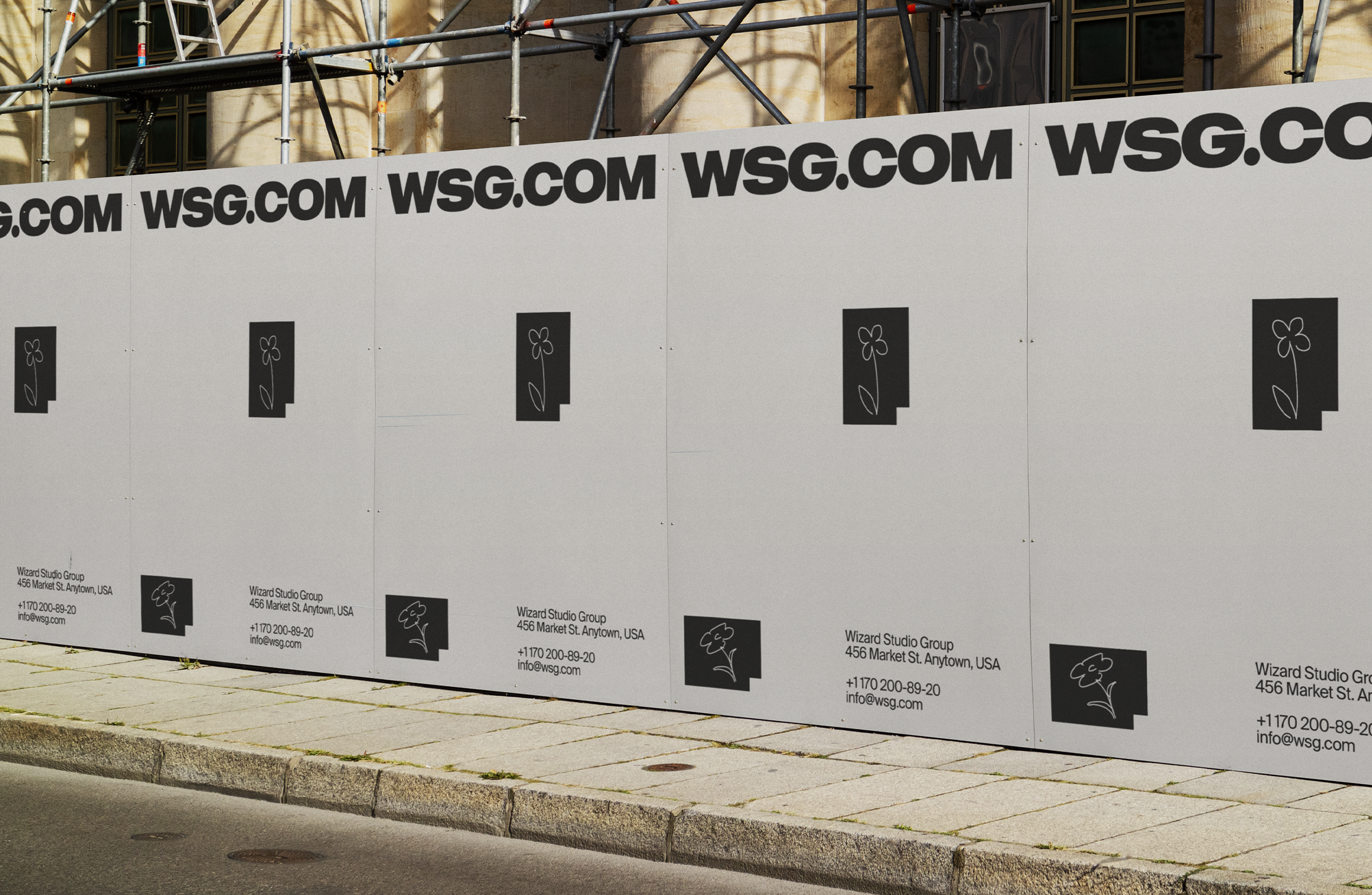
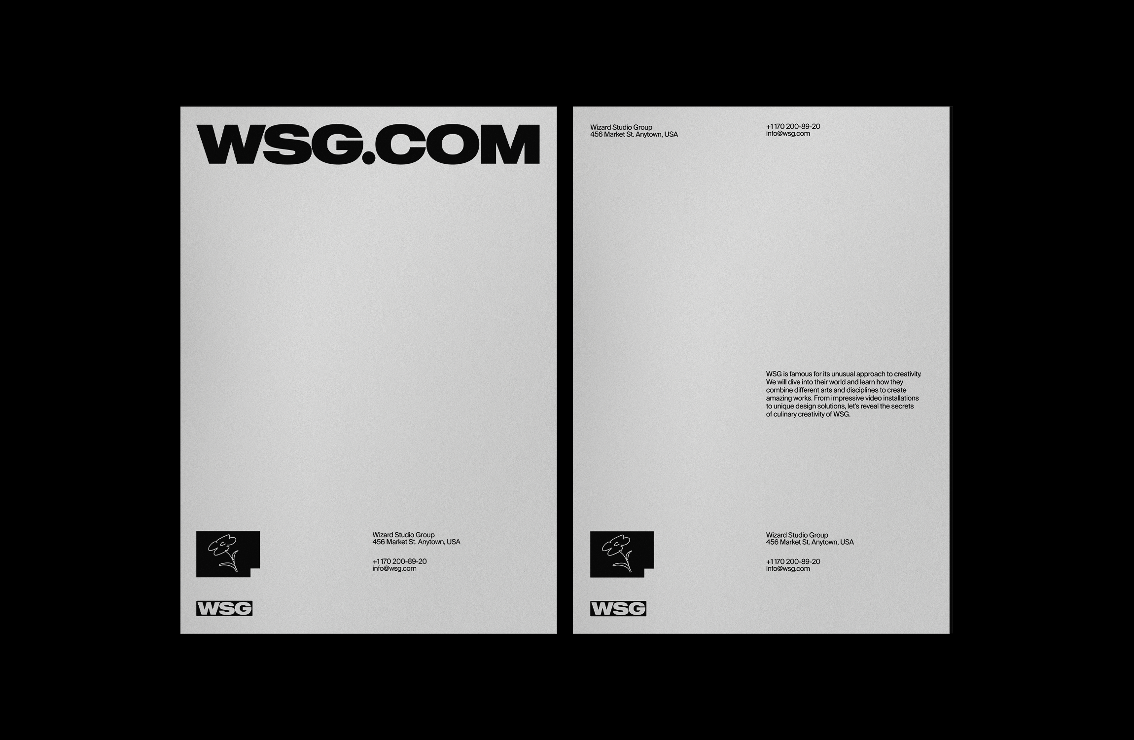
The transformation of WSG was not accidental — it was engineered. We began with brand strategy and positioning: who is WSG for, what does it stand for, and how should it feel in the hands of someone who has never heard of it? From there, we moved into logomark development — a process that generated dozens of concepts before the final mark was resolved. The chosen direction is geometric in its bones but editorial in its expression: precise angles, deliberate weight, and a structure that reads clearly at any size. The full identity system extends this logic across every surface — print, screen, motion.
03
Built Different
Typographic System
Neue Plak
Headlines & Display
Europa Grotesk
Body Text & UI
04
Brand Philosophy
The WSG identity is built on a single conviction: that great design should be invisible in use but unmistakable in effect. The logomark doesn't shout — it holds its ground. The typography doesn't decorate — it organises. The colour palette doesn't trend — it endures. Every element was chosen for what it does, not how it looks in isolation. The result is a system that works as hard in a PDF attachment as it does on the side of a building — consistent, purposeful, and built to last.